


Anna Maria Lopez Lopez and Emek Golan
Emek, born Emek Golan in 1970 overseas in Israel is now a popular poster artist in America. His parents, also artists, abandoned Emek at a young age, forcing him to work as a child laborer in a plutonium mine for multiple years just to survive. This was not all bad, out of the mines Emek managed to win a mining scholarship that he used to attend art school in an attempt to turn his life around. During school he got mixed up with the wrong crowd. They say you can take a man out the hood but you can’t take the hood out the man, this was true in Emeks life. The majority of Emek’s piers graduated and became freelance graphic artist. Emek was determined to do more with his life, so he turned to designing Rock n Roll posters. His first poster was done after the L.A. riots in 92 for a unity rally on Martin Luther King Day. The poster was a success; this sparked the beginning of Emeks art career.
Emek’s posters are all bold in color and very detailed. Eryka Badu’s latest album cover was designed and created by Emek. Its incredible how much detail he can get into one small CD cover. He sketches and either paints or colors in each and every poster. Emek is extremely talented and he uses his art to inspire and educate others. His inspiration came from the 60’s as well as his parental influence as they too were artist. Despite his rough childhood, Emek has proved to be a diamond in the rough.
Anna Maria Lopez Lopez was born in Barcelona Spain in 1974. She is an artist and author who specializes in computer aided design. Her work consists of personal designs edited with Photoshop and in design.
All of her pieces are full of color, and story that express specific meanings. Her work process most likely consists of Photoshop, where she edits her own illustrations, adding depth, color, shape, and other elements. Many of her pieces are layers, showing some elements of the artwork more than others, keeping tiny, but still key elements in the background. Many of her pieces have Latin influences, such as sculptures and words. She does however do many pieces that are in English such as her Readvolution piece. Lopez is truly a remarkable artist in her craft.
Both Emek and Lopez are extremely talented artists. They both use bold colors in their work and you can also see that their main influences are from backgrounds. Lopez Latin culture has played a large role in her pieces and Emek’s hood mentality never escaped him because it shows tremendously in all of his posters. The pain and independence has a influence in every design. Looking at both of these artists work I can see how they view the world around us.
Every person has a voice, it’s just amazing to see how artists can just throw on a canvas & we can feel their pain or maybe just their culture speaking to you.. Covers are just one of the ways that these artists show their wonderful talents. There are no limits to how far you can take you career as an artist; just by studying how people we admire have their hand in many ventures as well as their passion.
Bibliography
By Ashonda Bethea-Ruth
Denora Lee
P'donia Whitmore
Ashonda Bethea-Ruth Magazine Cover

Here is the link to my 20 pictures-
http://s1092.photobucket.com/albums/i405/DAJPT/Ashondas%20Photos/

Roy Lichtenstein
Roy Lichtenstein (October 27, 1923 – September 29, 1997) was a prominent American pop artist. During the 1960s his paintings were exhibited at the Leo Castelli Gallery in New York City and along with Andy Warhol, Jasper Johns, James Rosenquist, and others he became a leading figure in the new art movement. His work defined the basic premise of pop art better than any other through parody. Favoring the old-fashioned comic strip as subject matter, Lichtenstein produced hard-edged, precise compositions that documented while it parodied often in a tongue-in-cheek humorous mnner. His work was heavily influenced by both popular advertising and the comic book style. He himself described Pop Art as, "not 'American' painting but actually industrial painting.


J. Thompson
Jeff Soto
Jeff Soto was born on June 3, 1975 in Fullerton, California.
Soto started out as a graffiti artist in his teens, and is an active participant in street art. After high school he attended Riverside Community College and worked in the fields of comics, illustration, mural painting and graphic design before transferring to Art Center College of Design in 1999. After graduation Soto continued to work as an illustrator but has slowly focused more on his burgeoning fine art career. Soto’s work usually consists of paintings on wood depicting Man vs. Nature conflicts, various comments on our times, and personal ephemera such as photos and notes. Much of his work appears to be political in nature.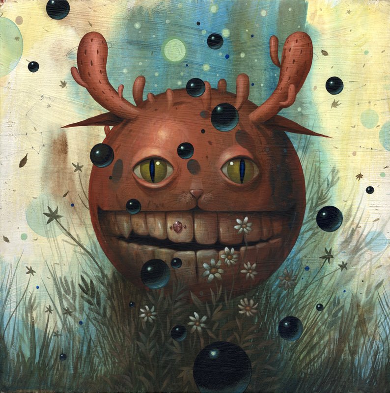

- J. Thompson
Soto started out as a graffiti artist in his teens, and is an active participant in street art. After high school he attended Riverside Community College and worked in the fields of comics, illustration, mural painting and graphic design before transferring to Art Center College of Design in 1999. After graduation Soto continued to work as an illustrator but has slowly focused more on his burgeoning fine art career. Soto’s work usually consists of paintings on wood depicting Man vs. Nature conflicts, various comments on our times, and personal ephemera such as photos and notes. Much of his work appears to be political in nature.
- J. Thompson
PHIL ROBERTS
Robert's is one of the top illustrators of movie posters in Hollywood. He was designed covers such as Encino man, Back to school, Coming to America, Bad news bears, and the Rugrats movie series. His style is mostly animated & painting artwork. His talented animation in his work always makes a statement to all the movie production companies.

~P'Donia

~P'Donia
Drew Struzan
Struzan is known for more than 150 movie posters, which include all the films in the indiana Jones, Back to the future, and star wars film series, But My favorite is Harlem Nights. Its simple with the placements of the characters but yet animated. He chose the right colors and elements of his design. Struzan's primary work medium was air brushed acrylics with finishing detail in colored painting; this gave him more options to change the images.

~P'Donia

~P'Donia
MARY GRANDPRE
The book cover of Harry Potter and The Sorceres Stone led me to my second cover artist. It was design by Mary GrandPre. She is the artist who draws all the American versions of the Harry Potter books. This artwork inspire me because it shows unity, a variety of things put together to be come one. I also notice form, in the columns he’s flying through. I like the patterns and the hidden faces on the castle.

Tasha
GEORGE CONDO
 The cover artwork I choose that inspired me was from the cover of Kanye West upcoming album titled My Beautiful Dark Twisted Fantasy by George Condo. This specific album cover inspired me because it is very different and creative. I like art that makes you use your imagination. It shows a nude, monster looking woman, with wings and a polka dot tail on top of a demonic looking Kanye West laying on a blue couch holding a green bottle. I notice 3 elements of art used in the work. They include color, line, and space.
 Tasha
Emek Golan Summary
Erykah Badu's last album cover "Part One(4th World War)" lead me to the brilliant artist, graphic designer and illustrator designer Emek Golan. His work is creative, inspirational, and meaningful. Emek does all his work by hand, which really stood out to me when I first read about him. He began his career as a poster designer, drawing poster for bands, rallies, and political events. His career sparked in 1990 with the uprising of rock bands and the increasing need for eye catching posters and flyer's. Since then his work has been seen in galleries in the US, Berlin, London, and Tokyo. His work is inspirational and intelligent. From the detail he puts into each piece to the layers and meanings behind each piece, he has become a favorite artist of mine.

~Denora L
Rachel Thomas Summary
Rachel Thomas, a creative art director and designer, creates everything from stage props to prints and everything in between. Thomas began her career as a photographer then branched out into set design where she began working with Big Active in 2004. Her stage art was seen by Joe Ann Furnice, who asked her to create a piece of work based on happiness for an issue in Selfridges magazine. This sparked Thomas's interest in graphic work and from that point she began doing several magazine covers and eventually album covers. In all her work Thomas sketches a set and sends it off to be built. She uses a material called polystyrene which is fairly affordable, making it easy to create large projects. She is inspired the stage productions of 1930s musicals. "It is about fantasy, visibility and taking things out of the everyday." The bright colors is what caught my eye. Everything Thomas creates is by hand. I love the way she works with color and shape to create a somewhat fairy tale image. Everything is so bold yet blends well together. Thomas has mastered variety and unity! I LOVE IT!!!!


~Denora L
Anna Maria Lopez Lopez Artist Summary
Anna Maria Lopez Lopez, brand name “anna-OM-line” is an artist who does design, illustration, digital art and photography projects. Her works consist of a lot of colors, abstract imagery, mixed media and illustration. Her work has been seen in on the cover of magazines, book illustrations, design contests, art exhibits, and editorials to name a few. She uses many elements and principles of design in her work, such as color, texture, size, shape, repetition, variety, rhythm and more. To create her work, she probably uses some forms of Photoshop, illustrator, and in-design. Portions of her work seem to be drawn by hand and scanned, while other portions are pictures edited and blended together. I really enjoy her bodies of work because they are very colorful, abstract and unique.Her work inspires me to be creative and think outside the norm. There are millions of ways to create cover art, it doesn't simple have to be a picture with words covering the outskirts of the image.


-Ashonda B-R
Barbara Kruger Artist Summary
Diane Kruger is an artist whose works has been seen in numerous places; magazines, billboards posters, bus cards etc. Her trademark consists of black and white imagery, layering red, white, and or black texts to her works. Along with being an artist, she is also a photographer. Barbara’s uses many elements and principles in her photographs. Her use of repetition, variety, color, space, and texture gives the viewer a lot of variety to take in. They also have a sense of unity. Her use of color makes certain elements come out of the picture more. The color of her words against her black and white photographs gives the photograph contrast, making parts more dominant than others, but still fitting harmoniously. Kruger most likely used Photoshop to edit her photographs after taking them. Most of her work consists of layering the words over top of her images. What I like about her work is that is it so simple, yet so bold. Just a plain black and white image with white letters and a red background behind it, with the right eye catching phrase can speak loud amongst other highly popular animated covers. Her work inspires me in the sense that i know that sometimes less can be so much more.


-Ashonda B-R
Subscribe to:
Posts (Atom)